Heatmap chart
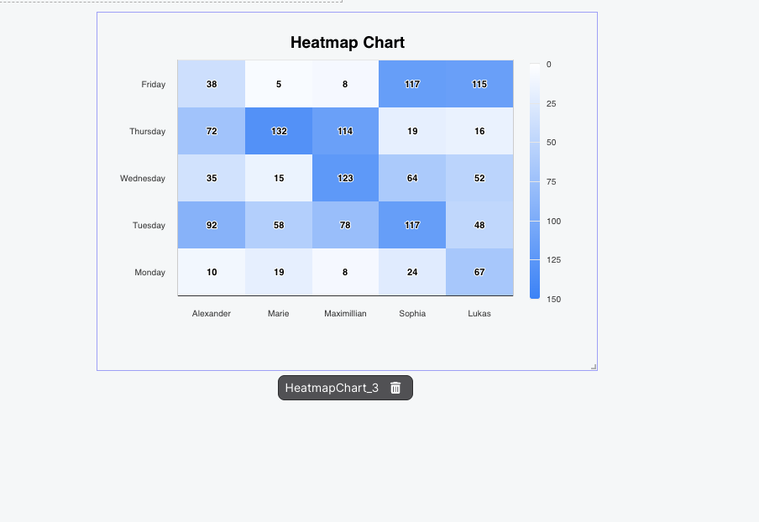
Peaka users now have the option to view their data in a ‘heatmap chart’ format, which provides color-coded way for presenting data.
Heatmap charts add a third dimension (color coding) to the X- and Y- axes and demonstrate the strength of the relationship between two variables. In addition to increasing the amount of information a chart can convey, this format also helps reveal underlying patterns and trends, which may be difficult to discern in a regular table.
Heatmap charts are excellent tools for displaying large amounts of data like cohort retention data for SaaS companies, employee performance data for sales teams, census data for government agencies, or meteorological data for climate scientists.